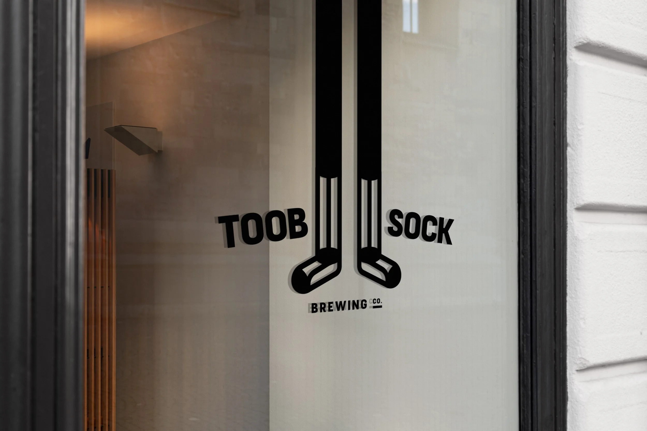
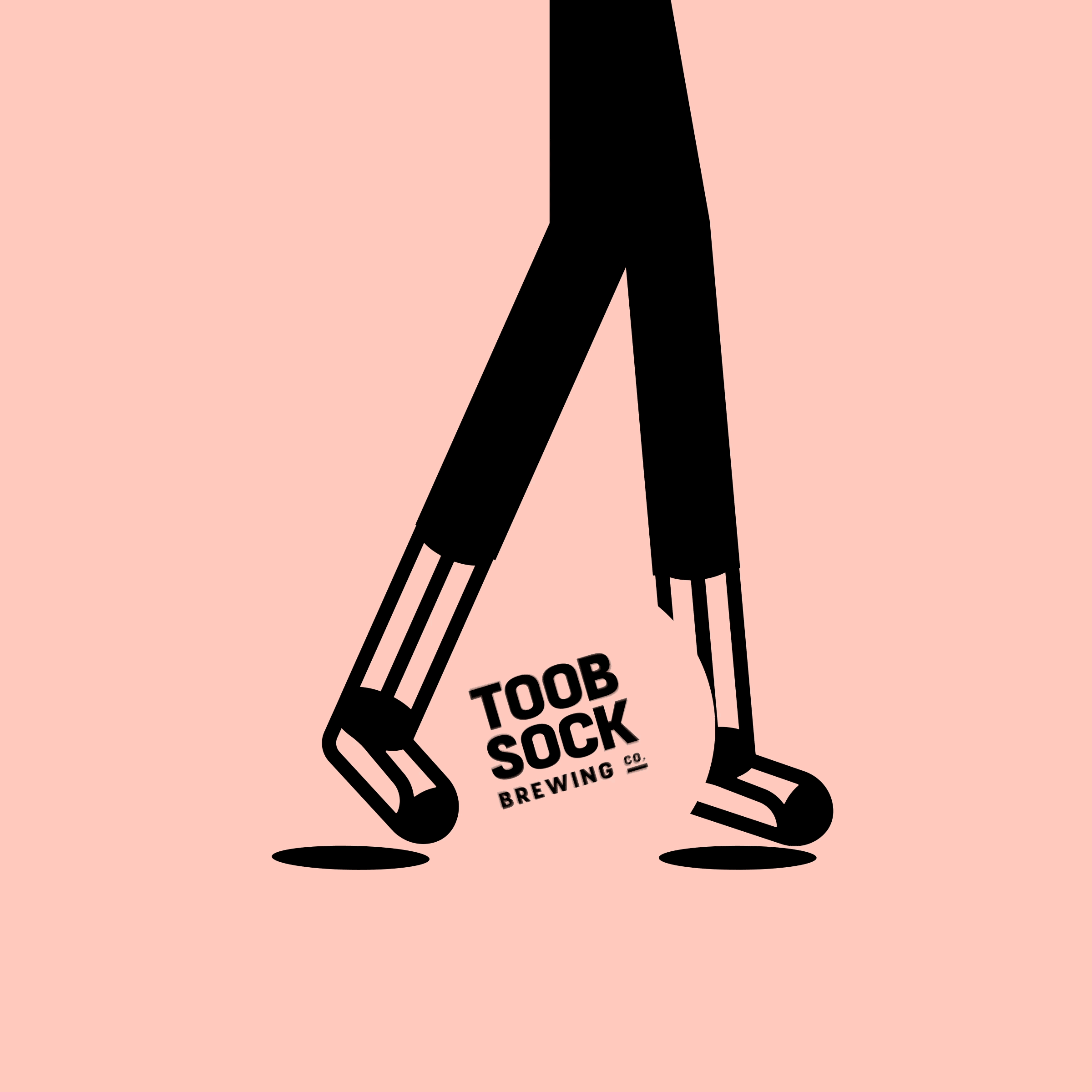
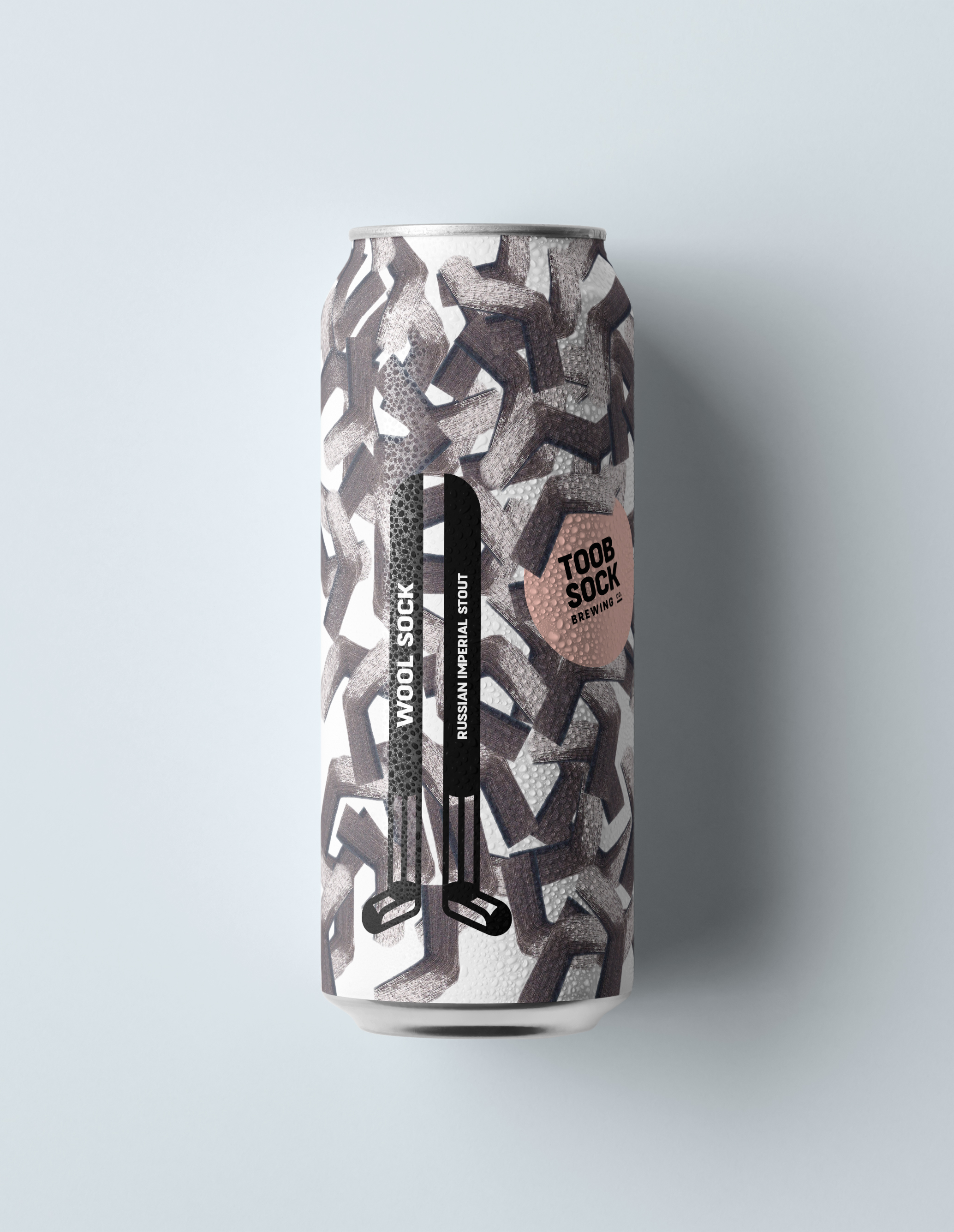
Toob Sock Brewing
Packaging + Identity
Print + Digital
2022
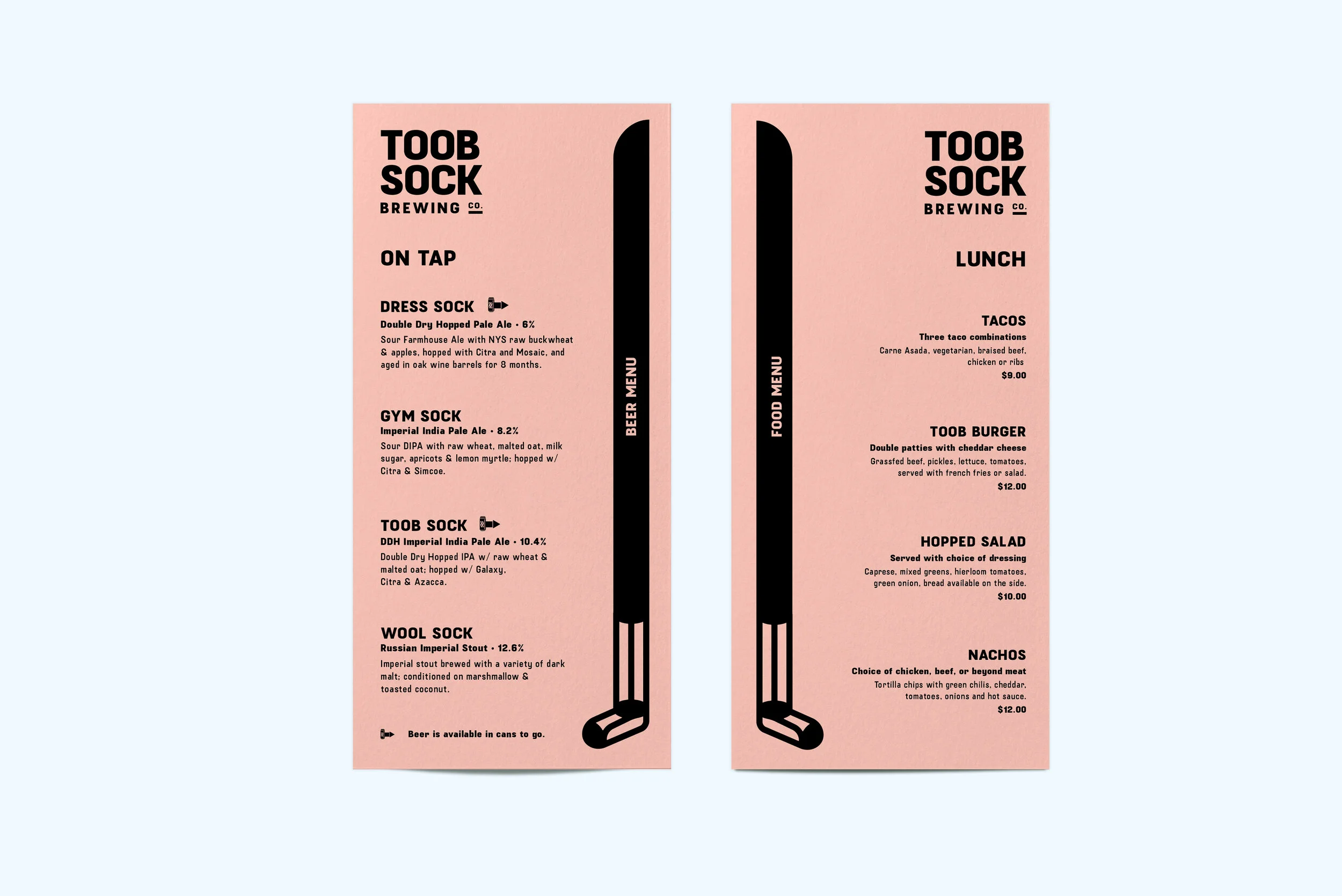
“Toob Sock Brewing Co.” is the materialization of my friend/client’s homebrewing-turned-brewery expedition. The name Toob Sock is derivative of a beer brewing apparatus nicknamed the “Hop Sock”, a mesh sock which separates the hops from the worth. I was approached with the task of creating a fun and excitable identity to separate TOOB SOCK from the crowded market of craft beer. What came out of this brand exploration is a fun, goofy, yet unique identity with the ability to expand the visual language as the brewery grows.


Process and Unused Options

Acrylic paint on Strathmore Sketch Paper. Illustrations were scanned into computer and modified via Photoshop.
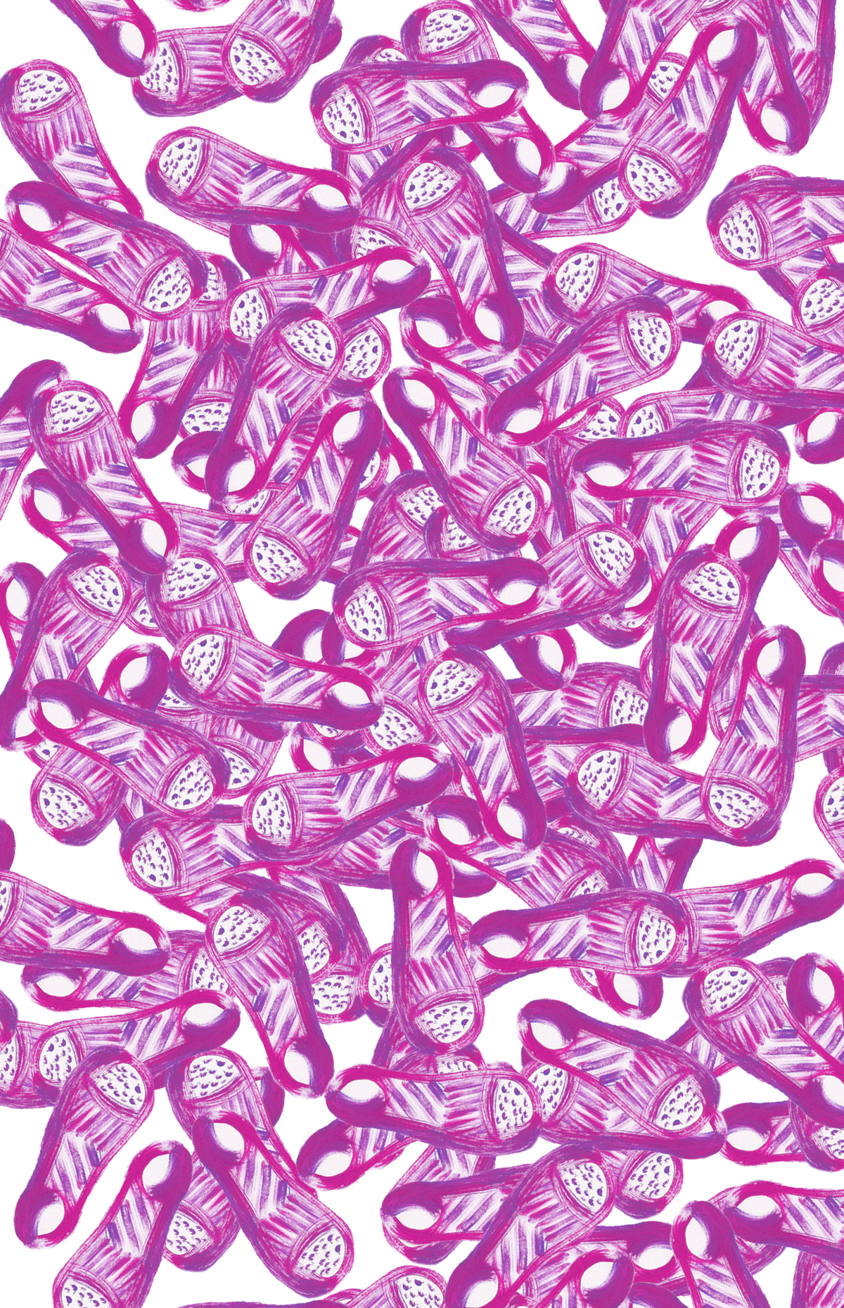

Close-up of scanned sock

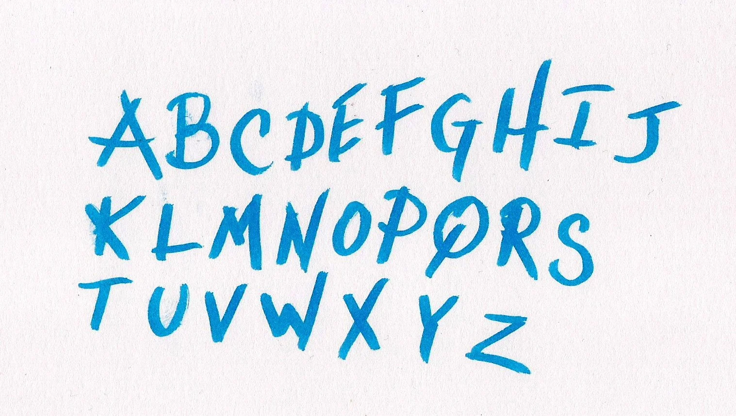
Unused hand drawn type
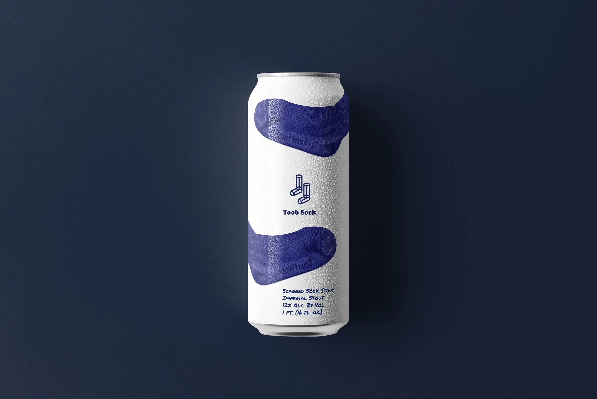
Unused packaging design
Logo explorations